Simple, modular, and accessible component library for your React applications.
Summary
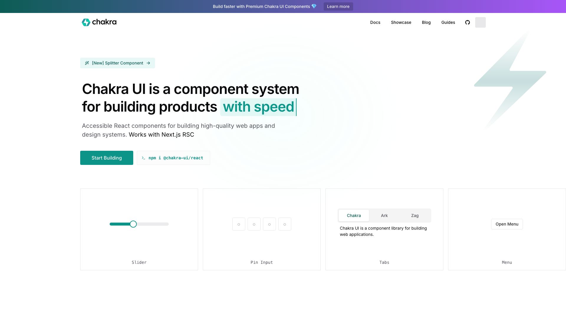
Chakra UI is an open-source component library designed to help developers build accessible and beautiful user interfaces in React quickly and efficiently. It provides a set of pre-built, customizable, and composable UI components that adhere to best practices in accessibility and developer experience.
The core philosophy behind Chakra UI is to provide developers with the building blocks to create user interfaces with ease, without sacrificing design quality or accessibility. It emphasizes a flexible styling system that allows for rapid prototyping and easy customization to match any brand's aesthetic. The library is built with TypeScript and provides strong typing for enhanced developer productivity and reduced errors.
Whether you're building a small personal project or a large-scale enterprise application, Chakra UI aims to streamline the development process, allowing you to focus more on your application's logic and less on reinventing common UI patterns. Its commitment to accessibility ensures that the applications you build will be usable by everyone, regardless of their abilities.
Key Features
- Accessible components out-of-the-box
- Themeable and customizable
- Developer-friendly styling system (Style props)
- Built with TypeScript
- Composability and extensibility
- Modern and clean design aesthetic
- Focus on developer experience (DX)